Sunday, May 17, 2020


The Joy of Home During COVID-19 Times
Townhouse interior by Mergal Architecture & Design photo by Peter Murdock

We normally associate our home with comfort, informality and time away from the office to enjoy the company of family, friends and loved ones, or to simply relax.  But during COVID-19 times things have gotten a little topsy-turvy.  Our lives have been turned on their head. We now work from home and our routines may clash with our spouse’s. Children may interrupt our day, yielding it less efficient.  Even for those without kids at home, or without spouses, working from home, for so many weeks, has made us loopy. COVID-19 has undeniably changed our notion of home.


Spiritual and motivational leaders exhort us to seek the “golden lessons” hidden in this tragic quarantine.  They ask us to look with optimism for the silver lining hidden behind this noxious pandemic and cite past plagues as proof that “this too shall pass” with a better future in the offing.


We architects are in the business of imagining a brighter and better future through our designs. But how can architecture help during this pandemic? I will posit the notion that well-designed traditional houses enable us to weather this so-called “new normal” better than houses designed in a modernist style for the following seven reasons. Traditionally designed houses:


1-    Are a collection of discreet rooms instead of undifferentiated spaces that flow into each other.  How many contemporary houses have living, dining, kitchen and family rooms that open “loft-like” to each other? In a well-designed traditional house rooms have doors which can be closed for privacy. 

Townhouse interior by Mergal Architecture & Design, photo by Peter Murdock

2-   Visually express the structural loads (from the roof to the ground) clearly giving us a sense of stability as opposed to visually defying gravity.
3-   Have vertically oriented windows (VOHs) - as opposed to bands of horizontal windows. VOHs respond to our innate sense of proportion, order and well-being.  They are anthropomorphic, i.e. they resemble a person; they stand vertically.

Townhouse renovation by Mergal Architecture & Design

4-   Tend to have narrow footprints (less than 25 feet wide, about 2 rooms wide), promoting cross-ventilation and natural light, which leads to a healthy environment.
Brooklyn house renovation by Mergal Architecture & Design
5-   Are designed following a local typology. In other words, houses that belong to a particular geographical and cultural area have similar architectural characteristics or a similar “architectural DNA”.  This lends a greater sense of stability and belonging – reassuring characteristics in unfamiliar times.

Dutch Colonial House designed by Mergal Architecture & Design


Good Neighbor


Bad Neighbor

7-   Use natural durable materials such as wood, stone, brick wool, cotton, and noble metals such as brass, copper, bronze and iron. For example: in neighborhoods that use painted wood fences they would not use metal or plastic fences. Or if wrought iron is used for the metal work, they would not introduce stainless steel. These houses are also safer; documentation exists that houses filled with synthetic materials reach flash points a lot faster than those filled with natural materials. Who would not want a safer, healthier house during pandemic quarantine times?

House in Bayside, NY

To conclude, a well-designed house will not cure all social ills caused by COVID-19, but it will go a long way to bring joy to its occupants and thereby contribute to their well-being.  Someone could argue that these seven reasons are elitist and cannot be universally applied.  My answer is that the application of these ideas does require a cultural shift: from a culture of disposable objects to one of conservable objects- a sustainable culture that conserves our resources.  A change is also needed to bring about a culture that honors the past instead of being so continually fascinated by the new as to forget its own history and the commonsense lessons contained in it.


Tuesday, May 7, 2019

New Houses in Historic Neighborhoods

What is it about historic or traditional neighborhoods that makes us want to live in them?  Is it their walk-ability or the scale and look of its buildings?...the materials used or their architectural detail? Is it the way they make us feel when we walk or drive around them, enjoying the way the landscape and the buildings intermingle with each other? Might it be a combination of all these factors?  Walk-ability, scale, durable materials, detail, good proportion, beauty, these are all terms that help to define the character that we want to preserve whenever we declare a neighborhood “historic”. 
traditional house in Bayside
In the USA, the Secretary of the Interior has issued Standards and Guidelines for the Restoration, Rehabilitation and Preservation of Historic Properties. For this blog post we will only look at the Standards for Rehabilitation. Rehabilitation is defined as: "the process of returning a property to a state of utility, through repair or alteration, which makes possible an efficient contemporary use while preserving those portions and features of the property which are significant to its historic, architectural, and cultural values." There are 10 standards for Rehabilitation, standard no. 3 states:  Each property shall be recognized as a physical record of its time, place, and use. Changes that create a false sense of historical development, such as adding conjectural features or architectural elements from other buildings, shall not be undertaken. Standard no. 9 states: New additions, exterior alterations, or related new construction shall not destroy historic materials that characterize the property. The new work shall be differentiated from the old and shall be compatible with the massing, size, scale, and architectural features to protect the historic integrity of the property and its environment. 
traditional house in Bayside
In my own neighborhood of Bayside, New York, we have seen several new houses built that follow those guidelines. Unfortunately their designs have, in fact, changed the character of the neighborhood.

new house in Bayside
The issue, as we see it, is that the meaning and nature of a “compatible” design is so wide that, in the hands of less skillful designers, it can lead to chaos and ugliness which in turn, can destroy the character of a beautiful neighborhood. In our contemporary culture, the word “beautiful” has been banned from the academic and professional lexicon for being perceived as a question of personal taste. 
traditional house in Bayside
There was a time, in the not too distant past, when entire neighborhoods were designed with houses coming straight out of architectural pattern books that proposed certain styles such as: Colonial, Federal, Palladian, Victorian, Dutch Colonial, and others.  They all had a number of architectural features that made them visually interesting such as correctly proportioned columns, projecting bays, oriels, deep eaves, brackets, stained glass and Palladian windows. These features were scaled in relation to each other and to the building. They all used a common language of architecture based on classical or traditional architecture and as such established a civic “architectural conversation” among all the buildings in the neighborhood.
traditional house in Bayside
That commonality of architectural intention, of a civic architectural language, is absent today.  Architects instead resort to a narcissistic architectural expression that either panders to their own or their client’s desire for uniqueness over the urbanistic common good or is the result of a lack of architectural design knowledge.  The new designs have a limited palette of architectural features and/or a hodge-podge of un-coordinated or repetitive elements which are not scaled in relation to each other or the building. These designs “look” traditional, but are far removed from a living tradition.
new house in Bayside with repetitive elements 

new house in Bayside with uncoordinated and badly proportioned elements
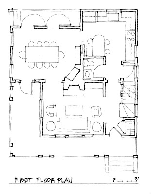
There are some who will state, as an excuse to continue building these unfortunate designs, that our contemporary needs cannot be accommodated using traditional architecture; that we have to use designs that are “of our time”.  We state that we need to have the humility to imitate the good designs from the past and learn from the ones that we have directly under our nose. We propose the following designs to illustrate this idea. The first one is a hypothetical design for a new house. The second one is a re-design of my house in Bayside.
new house design
new house design first floor
author's house in Bayside


Unless designs for new houses in historic or traditional neighborhoods start fitting into, instead of contrasting with the existing architecture, our neighborhoods will deteriorate and lose their value.


Friday, August 17, 2018

Renovations in Historic Districts


We recently designed the renovation of a house in an area of Brooklyn known as Prospect Park South, designated a Historic District by the New York City Landmarks Preservation Commission (LPC) in 1979.  This area was first developed by Dean Alvord who acquired the land in 1899.  Alvord wanted to create a rural park within the city’s street and block system. To achieve this, he hired John Aitkin a Scottish landscape gardener who planted trees at the building line instead of the curb line to make the streets look wider. 


Aitkin separated the sidewalks from the streets by using a landscaped eight-foot strip; prohibited fences and allowed hedges only behind the building line to screen the backyard. The houses were placed in the middle of the landscaped lot to stress the “house in the garden” quality of the development. They were built for people who worked in the city but wished to live in the country.

The houses of Prospect Park South exhibit a wide stylistic variety. Having said this, there are enough houses with clapboard and shingle facades making the use of these materials a unifying feature. Most houses employ some interpretation of a typical Colonial Revival style; they tend to use projecting bays, oriels, deep eaves, brackets, stained glass and Palladian window motifs.
The chief architect of Prospect Park South was John Petit who also designed our client’s house, in 1901. Here’s a quote from the LPC’s designation report:
             “ Petit was undoubtedly familiar with the architectural publications of his time, particularly with Architecture and Building, a magazine that published articles on Prospect Park South, as well as a number of separate designs by Petit.  In his designs Petit incorporated stylistic details found in published architectural drawings and photographs.  Although he borrowed many stylistic ideas from these sources, all of his best works show a sophisticated design sense that is lacking in the works of less skilled revival architects.”
The picture above illustrates slenderized pilasters holding up a full entablature over a projecting entrance bay. The leaded glass windows seem to be original to the house.
Brackets support the perimeter beams at the porch
Working under the scrutiny of the LPC, our idea was to transform the house with all the modern conveniences of double glazed windows, water saving plumbing fixtures, energy saving light fixtures, and a 21 st century kitchen in an elegant way that harmonizes with Petit’s original design. At the end of the day one would look at our design and think that this was Petit’s design. We measured all the interior walls and features of every room on every floor and all the exterior elevations as accurately as possible. The information gained was used as a basis for the design details of the house renovation on the interior as well the exterior. 
The existing kitchen is very dark since it only gets north light from two small windows. It's existing eat-in area ended up in a left over space between the kitchen and the dining room and is dark and cavernous.


The client requested a new eat-in-kitchen oriented towards the back garden and an enclosed back porch that would restore the original connection between the back garden (“house in the garden” idea) and the dining room. 

The new plan layout centers the kitchen around an island that can also accommodate seating for a quick snack; a built-in banquette comfortably sits 6 persons in the new breakfast nook.  The cooking area of the kitchen is on the north half and has its own small salad sink. The dishwashing area is on the south half and has a big sink and dishwasher. The dining room opens to the enclosed porch which in turn opens to the back terraced steps into the backyard. The new kitchen will connect with the existing dining room, not only through the existing door but also, via a new pass-through centered on the two existing dining room doors.

Note the “pass-through” doors open the dining room to the kitchen for ease of serving and for a visual connection when opened.
The new stove is centered on the island and in-between the two existing windows. The window casings dovetail into the wood trim system above.
The new refrigerator is paired with the kitchen entrance from the front of the house.  Both are centered on the island which will have a beautiful hanging double light fixture combined with a pot rack to visually unify the room. Note the wood trim system at the top of the cabinets, windows, and doors which also serves to unify the room.
The double pass-through doors will open unto the dining room for ease of serving dishes as well as collecting them directly into the dishwashing area.

The breakfast banquette faces the back garden and is bathed in abundant east light which is perfect for a breakfast area.
The New York City Landmarks Preservation Commission (LPC) reviews the design changes to all the façades before approving any project. So, a “case” must be carefully constructed around precedent in addition to the Owner’s needs. We were extremely lucky in that the clients found a historic photo showing the original back of the house. This pointed in the direction of a “post and lintel” system which is how we designed the new porch and kitchen windows facing the backyard. 

The new window systems infill in-between this post and lintel system thereby unifying the back façade and making it more cohesive. They will bring a lot more light from the east, which is optimal for breakfast rooms.  
Many owners dislike the LPC because they find their requirements too onerous. Yet, LPC’s involvement helps to keep the property values up by keeping the design integrity of the original neighborhood.
When renovating a house in a historic district there are 5 principles to keep in mind:
1-     It is possible to upgrade your house to 21st century standards while keeping the look of the original design.
2-     First things first (part A) - Do not let a favorite design image clipped from a magazine or a website get in the way of an organized plan with a well thought out circulation pattern.
3-     First things first (part B) – The most expensive rooms to renovate are the kitchen and the bathrooms so it is very important to plan them well and get them right.
4-     Let the architecture and the interior moldings of the original house point the way to what the “look” should be.  The result will be a harmonious design.
5-     Look for old photos of the house or historic precedents in the neighborhood to support your argument with the historic governing agency.


Wednesday, March 21, 2018

Beauty is Not Elitist

Half photo by Steve McCurry

The pursuit of beauty has been with us for a very long time; Plato, Aristotle, Augustine, and Aquinas all have something to say about it. In our modern smugness we have come to associate beauty with a quest. Indeed, most of us accept the trite maxim that beauty is in the eye of the beholder as self-evident. This may be the reason that architects do not discuss beauty, because it is a question of taste.  So, architects prefer to use phrases like “form follows function” or “less is more” to justify a particular aesthetic choice. But, this sidesteps the question.
Library at Ephesus c. 117 AD

Back in the first century another architect, Vitruvius, wrote the Ten Books of Architecture.  In one of them he talked about the 3 defining qualities of architecture: commodity, firmness, and delight. In our 21st century sophistication we have convinced ourselves that what Vitruvius was really saying is that commodity + firmness = delight. In fact, he gave equal weight to all three. He meant us to address the question of delight with equal weight as the question of firmness and commodity. The difficulty arises when we attempt to define beauty, or at least to understand what its nature is.  In order to do that we have to dig a little deeper into ourselves, into who we are and why we are here.

In Plato’s Symposium, Socrates calls beauty the “object of every love’s yearning”. Similar to Plato, Augustine in Book 4 Chapter 13 of the Confessions says this of beauty: “Do we love anything but the beautiful”? For Augustine beauty is the form a thing should have. This is a far cry from “form follows function” unless (God forbid) we believe that our reason for being is merely utilitarian. 
Ashmolean Museum, Oxford by CR Cockerell 1845

For Aristotle art is the imitation of nature, not simply as a record of nature but, more as a way to engage universal themes and to provoke the audience to think about these ideas. The greater the skill of the artist, the more engaged the audience will be.  Saint Thomas Aquinas says that beauty is that which pleases upon being seen because it is admirable, it possesses qualities in itself which make the object worthy of admiration. Beauty is complex, it is mysterious, it fills your soul and makes you whole, it rings true, it is good.
Morgan Library, New York City, McKim, Mead, and White 1909

For architects and designers, these philosophical considerations remain abstract unless we make them concrete with examples made of bricks and mortar. Presumably, something worthy of admiration is an exemplar of its kind and exemplars are not “one-off” exemptions but part of a set of things that have similar characteristics. In the case of architecture therefore, we would talk about buildings that are recognizable as buildings because they have roofs, supports, walls, windows, entrances, bases, stairs, and other items that are typically associated with buildings. Our expectations are such that we demand stability, symmetry and a clear path of the loads from the roof through the columns and/or walls to the base and then to the ground.  Anything that frustrates that will also frustrate our sense of what is beautiful. But, having buildings that are recognizably buildings does not by itself make them beautiful; there are plenty of buildings with roof, pediments, neatly arranged windows and symmetrical massing that are simply ghastly.

Freer Gallery, Washington DC by Charles Platt 1921

Arguably, we refer to what is a classic as the best exemplar of something in its genre and therefore classical buildings (not the style but the object itself) are exemplars of the best that traditional architecture has to offer. Of course, there are beautiful classical buildings and there are many degrees of in-between buildings that are more or less beautiful, and some that are plain ugly.


Frick Collection, NYC,  garden facade by John Barrington Bailey 1977

In the Renaissance Alberti, like Vitruvius, also wrote Ten Books of Architecture. In Book Six, he said: “Beauty is the reasoned harmony of all parts within a body, so that nothing may be added or taken away, or altered but for the worse”. In Book Nine: “Beauty is a form of sympathy and consonance of the parts within a body, according to a definite number, outline, and position as dictated by concinnitas, the absolute and fundamental rule in nature. This is the main object of the art of building, and the source of her dignity, charm, authority, and worth”. As I understand it concinnitas is a mix between proportion and harmony.


Havana, 2004 photo by Jeffrey Milstein

In conclusion, it seems that beauty can be very hard to describe but, we know it when we see it. Beauty does not discriminate among people. You can be rich or poor, western of Asian, white or black and still are subject to the same susceptibility to beauty.  Beauty is not the purview of a certain group or class of people.  It is not intrinsically related to wealth, nor your status in society. Beauty is not elitist, it simply is.

Yauco, PR, photo by author

Sunday, November 19, 2017

Preservation: Conservation vs. Innovation


Bracket detail with foliated anthemion and acanthus
Historic preservation is arguably a game of conservation. The architect carefully examines what original building fabric can be kept, decides what needs to be preserved, and then he or she determines which elements have no historical significance and can therefore be discarded. If the building in question is considered a NYC Landmark or is part of the National Register of Historic Buildings (official list of places and buildings considered worthy of preservation by the National Park Service, a branch of the U.S. Department of the Interior) then, this activity is carefully monitored by the agencies to ensure an accurate preservation.

Rainbow Room C.1987
Round bar at New Amsterdam Theater c. 1994
For my late mentor Hugh Hardy, preservation was never synonymous with “placing buildings in formaldehyde;” instead, it was an opportunity to bring life to historic buildings and places. He had a “creative restoration ethos” which implied that restoration is never a “pure” act since one is always interpreting it from the vantage point of the present. He and I worked on a number of restorations including the New Amsterdam Theater, the BAM Harvey Theatre, and the Rainbow Room. Design remained central to all our conversations any guidelines by the Landmarks Preservation Commission or the Secretary of the Interior informed our decisions. 
BAM Harvey Theater
Because it is not located in a historic district, the BAM Harvey Theatre lended itself to innovation. For his production of the Mahabharata, Peter Brooks desired to represent the reality of the deterioration in the theatre. Hardy gleefully obliged and decided to do something unusual in most restorations: to arrest the state of decay and dilapidation in time. He maintained the visual evidences of the building’s passage through time while making accessible the public amenities of any other theater: AC, bathrooms, coat closets, and concession stands.  Can you imagine a more incongruous state of affairs? Such an “enfant terrible” attitude would be dissonant in preservation circles. 

After 14 years with Hardy at HHPA I decided to turn my attention to Classicism, and after participating in the certification program at the Institute for Classical Architecture in NYC, I became a “card carrying Classicist”. I worked with Ferguson Shamamian for 4 years, Roger Ferris for 2, and then worked for Jaque Robertson at his firm, Cooper Robertson. 
St. Luke's Episcopal Church Parish House
Jaque and I worked on the St. Luke Episcopal Church’s Parish House. The building was designed by Thomas Nash in 1910 and was modeled after a church in Maidstone, England. It is situated in East Hampton’s Historic Village District and is neighbor to the Home Sweet Home Museum which is a house dating back to the 1720’s. Our addition was scrutinized heavily by the East Hampton Historical Society to insure a harmonious integration in the historical setting. We were careful to keep the overall height lower than the church proper and in fact the Parish Hall portion of the addition is housed in a one-story wing that defers in scale to Home Sweet Home to the north. Nevertheless, the Parish House is no slavish copy of either the Church or the parsonage. Its quirky facade takes cues from both, transcending into a new creation which occupies its place between them with aplomb and contributes to a trialogue.
31 East 38 entry hall
31 East 38 living room


Our work at 31 East 38th Street does not involve the innovative preservation techniques of The Harvey, nor the creation of a new building as a fitting addition to an already harmonious ensemble. It is a more nuanced approach where, entirely new interiors are designed to fit seamlessly into the existing townhouse in such a way that when all is finished, one would not be able to tell exactly where the original ends and the new begins.  The house had originally been built as a single family house but converted to multi-tenant use in 1937. Our renovation reverted the house to single family use. The interior looks as if it was always there; yet the only rooms that were always there are the main stair and the entry hall.
330 Riverside Drive
Another single family townhouse: 330 Riverside Drive, never had a complete restoration since it was built in 1901. There are many technical requirements that need to be met to protect the health, safety, and welfare of the inhabitants and immediate neighbors: fire safety, egress, as well as the latest plumbing, mechanical, and electrical codes. A new elevator will be added in place of the old staff spiral staircase that connects all 5 floors and the cellar.  The 4th and 5th floors will be gutted and the bedrooms redesigned so that each one has an “en-suite” bathroom. A new kitchen, pantry, and laundry room will bring these rooms into the 21st century. Several rooms will require a more specialized “surgical intervention” where existing rooms will be modified in subtle ways to accommodate new programmatic requirements and new technologies, arguably making the new room better than the old, not only from a programmatic point of view but also from an aesthetic one.  Our hope is that upon walking in for the first time, your eye will be fooled into thinking that this interior was always that way.

330 Riverside Drive skylight over central stair
330 Riverside Drive- fireplace inglenook seen from central stair